
In summary
The best-looking ultimate frisbee jerseys usually get a few simple things right: strong use of color, a light and dark set that works together, numbers that stay readable from a distance, a cut that suits the player wearing it, and fabric that keeps the design looking sharp throughout the season.
- Sublimation gives you much more freedom to use colors, gradients, patterns and detailed artwork.
- A well-designed light and dark jersey set gives your team a stronger identity and avoids unnecessary color clashes.
- Fit, numbers and fabric matter just as much as the artwork. A great design still needs to work on the field.
On this page
Good ultimate jersey design isn’t just about personal taste. There are practical things you can check before a kit ever reaches the field: contrast, color balance, readability, fit and how the finished design holds up over time.
Full-color sublimated designs
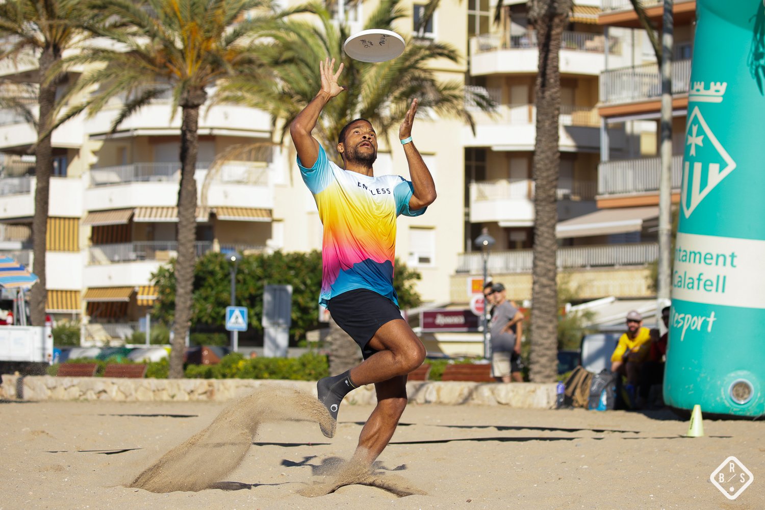
One of the biggest advantages of sublimation is the freedom it gives the designer. Instead of limiting a jersey to a small number of printed colors, sublimation allows detailed, full-color artwork to become part of the fabric itself.
That makes gradients, patterns, illustrations, textures and all-over designs possible without having to build the artwork around a traditional limited-color printing method.
But having more freedom doesn’t mean you need to use every color available. The best ultimate jersey designs still have a clear visual hierarchy: a main color, supporting colors and enough contrast for the important elements to stand out.
If you’re choosing colors for your team, see our guide to choosing kit colors for practical advice on building a combination that works on the field as well as on screen. When you’re ready to start, our custom jersey design guide walks through the process from brief to proof.
Light and dark jersey sets
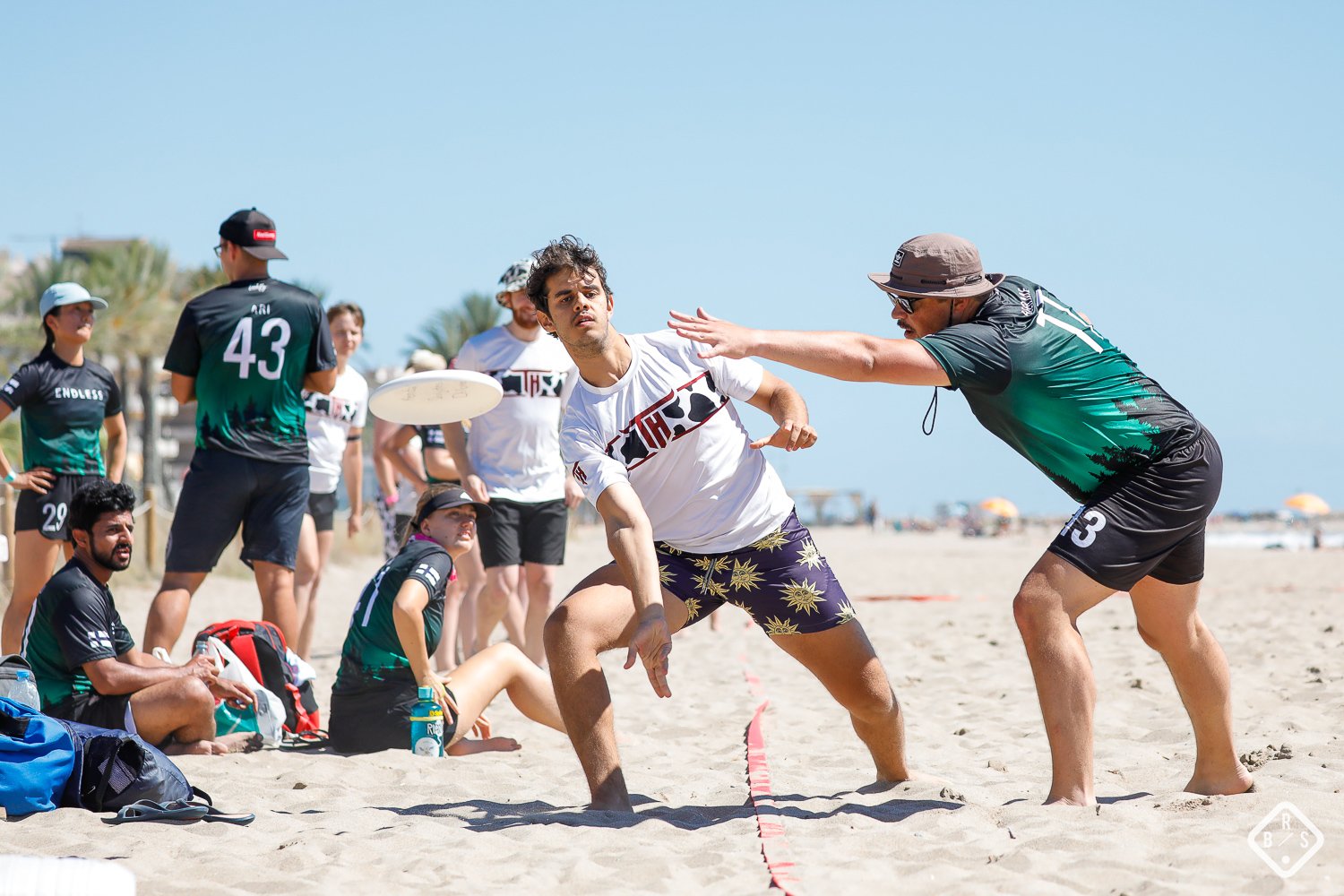
One great jersey design only solves half the problem. Your team also needs to be prepared for games where your colors are too close to the opposition’s.
A light and dark jersey set gives you two distinct versions of the same team identity. Instead of simply changing the color of the background, the two designs can use the same graphic language, typography and details while working with different levels of contrast.
That matters on the field, but it also makes your team look more consistent in tournament photos, match footage and team content. Two jerseys designed as a pair look intentional rather than like a backup option.
Our ordering guide treats one light and one dark jersey as the standard setup, while our colors guide explains how to choose colors that work across both.
Readable numbers
A jersey can look fantastic up close and still fall apart visually from twenty meters away if the number disappears into the background.
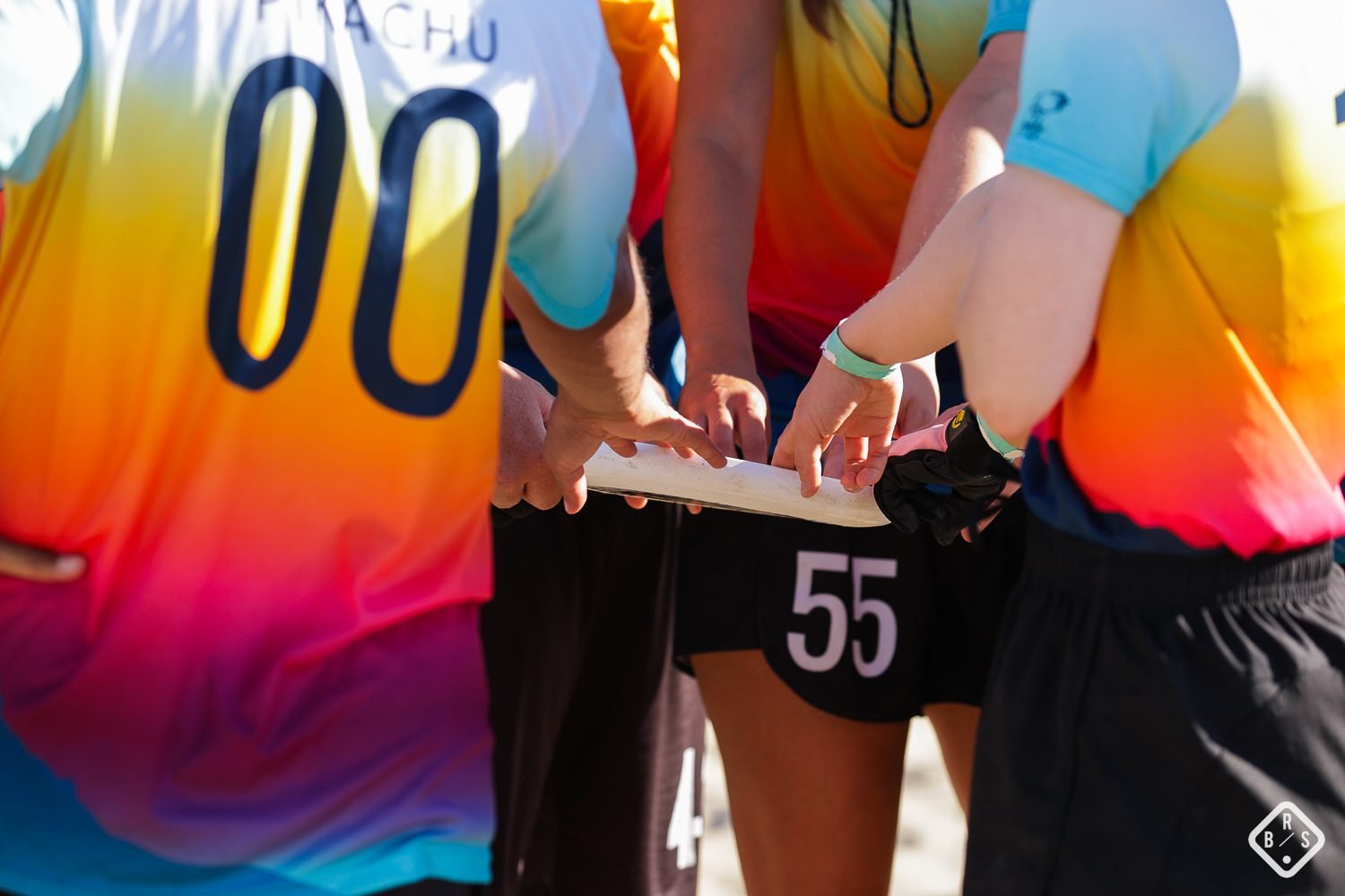
Numbers need to be readable during a game, from the sideline and in photographs. That means contrast matters more than decorative detail.
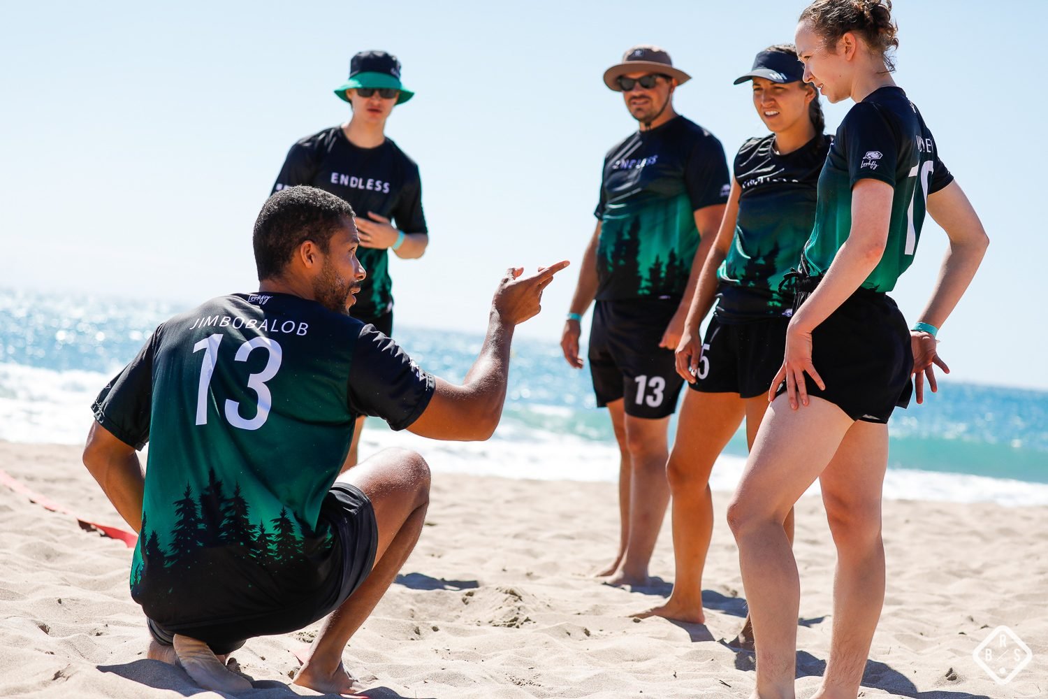
Use a number that stands clearly apart from the background, choose a font that remains easy to read at a distance, and make sure the artwork behind it doesn’t interfere with its shape.
This is especially important with all-over sublimated designs. A background that looks great on its own can make a number difficult to read once the two are combined. Our colors guide covers the contrast and sizing principles we use when designing team kits. For exact sizes and fonts, see our jersey number design guide.
Cut and fit
The best-designed ultimate jersey in the world won’t look its best if the player wearing it has the wrong cut or size. Fit is part of the overall appearance of a jersey, not something to decide after the design is finished.
A jersey that is too tight across the chest or much longer than expected can change how the artwork sits on the body. A good design needs to work on the actual players wearing it, not just on a flat digital mockup.
Manta Squadron jerseys come in both a looser cut and a fitted cut, with seven sizes available across both. The choice is about how the player wants the jersey to fit, so don’t assume that everyone on a team should choose the same cut.
If you’re collecting sizes from a mixed roster, see our ultimate jersey sizing guide for how to choose the right cut and size for each player.
Not sure what to ask for?
Send us your rough idea and colors and we’ll tell you what’s possible.
Fabric that holds its look
A jersey that looks great on day one but starts looking tired after a few weeks isn’t a great-looking jersey for very long. The material and construction are part of the finished design because ultimate jerseys have to deal with sweat, movement, sun and repeated washing.
Sublimation also has an advantage here. Because the design is dyed into the polyester fabric rather than applied as a separate surface layer, there isn’t a printed layer sitting on top of the fabric that can crack or peel like some surface-applied graphics can.
Manta Squadron jerseys use a 145gsm recycled polyester knit with bonded, flatlock seams. The recommended care is simple: machine wash at 30°C and avoid ironing.
Common ultimate jersey design mistakes
- Using too many colors without a hierarchy.Sublimation gives you plenty of freedom, but that doesn’t mean every color needs to compete for attention. Give your main, supporting and accent colors clear roles.
- Designing only one jersey.A single striking design can still leave you with a problem when an opponent wears a similar color. Design your light and dark sets together from the beginning.
- Letting the numbers disappear.Always check the contrast between the number and the actual artwork behind it before approving the final design.
- Choosing the cut or size by assumption.Players have different fit preferences. Let each player choose the cut they want and then select their size using the correct measurement chart.
- Using low-resolution logos.A logo that looks fine on a laptop screen can become soft when enlarged across a jersey. Use the highest-quality artwork available, preferably a vector file.
What makes an ultimate jersey look great?
There isn’t one formula for the best-looking ultimate frisbee jersey. A minimalist design can look just as strong as an intricate all-over pattern.
What matters is that the design feels intentional and works as a complete kit.
- Color: the palette has a clear hierarchy and enough contrast.
- Design: the artwork uses the freedom of sublimation without becoming unnecessarily busy.
- Light and dark sets: both jerseys feel like part of the same team identity.
- Numbers: players remain identifiable from the sideline and in photos.
- Fit: the cut and size work for the player wearing the jersey.
- Fabric: the jersey continues to look and feel good throughout the season.
Most importantly, the jersey should look like your team. A strong custom ultimate jersey isn’t just a good-looking shirt. It gives your club a visual identity that players recognize and are proud to wear.
Frequently asked questions
What actually makes an ultimate jersey look good?
A strong ultimate jersey combines a clear color palette, good contrast, a coordinated light and dark set, readable numbers, a suitable fit and fabric that keeps the design looking good throughout the season.
Does using more colors cost more with sublimation?
Sublimation allows full-color artwork without the traditional per-color printing structure of methods such as screen printing. That makes gradients, patterns and detailed artwork much easier to use without designing around a limited number of colors.
What’s the best fabric for a sublimated ultimate jersey?
Sublimation is designed for polyester fabrics. The right fabric also depends on weight, breathability, fit and construction. Manta Squadron jerseys use a 145gsm recycled polyester knit with bonded, flatlock seams.
Do ultimate teams need both a light and dark jersey?
A light and dark set gives your team more flexibility when playing opponents with similar colors. It also lets both jerseys work as part of one consistent team identity rather than treating one as an afterthought.
How do we make sure our numbers stay readable?
Use strong contrast between the number and its background, choose a legible font and check the number against the actual artwork before approving the final design. Our colors guide covers the contrast principles we use.
Will a sublimated jersey still look good after a full season?
Sublimation integrates the design into the fabric rather than applying it as a separate surface layer, so there is no printed layer to crack or peel in the same way as some surface-applied graphics. Following the recommended washing instructions also helps keep the jersey looking its best.