
In summary
Choosing colors for an ultimate frisbee jersey is about more than picking your favorite shades. Your colors need to work together on the field, keep numbers readable, work across light and dark jerseys, and still look like your team.
- Plan a light and dark jersey set rather than relying on one color combination.
- Use enough contrast for players, numbers and patterns to remain easy to identify from a distance.
- Don’t choose colors based only on printing cost. Sublimation gives you much more freedom to use full-color designs.
- Check your colors for color vision accessibility rather than judging every combination by eye.
On this page
Light and dark ultimate jerseys
Ultimate jersey color contrast
Choosing colorblind-friendly jersey colors
Sublimation and jersey color choices
Your team colors become part of your identity. They appear on jerseys, shorts, warmups, flags, social media and tournament photos. So it is worth spending a little time getting them right before the design goes into production.
Light and dark ultimate jerseys
The first decision is simple: don’t design just one jersey if you can avoid it.
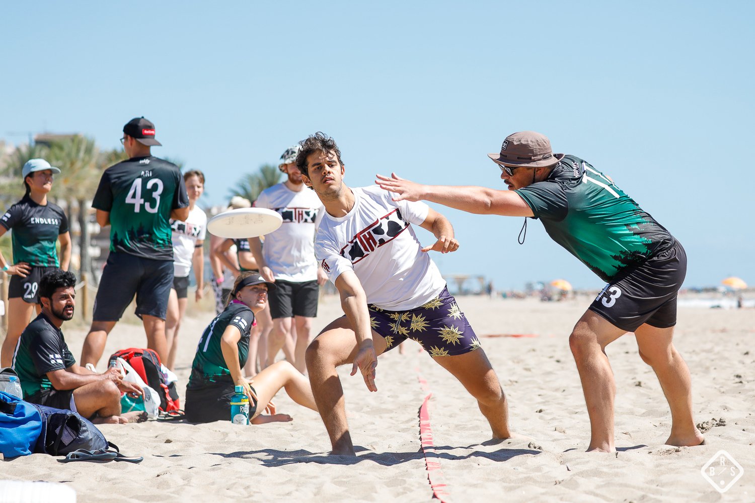
A light and dark set gives your team flexibility when playing opponents with similar colors. It also gives you two versions of the same team identity instead of having to improvise when a color clash happens.
For WFDF events, teams are required to bring at least two distinct sets of shirts to each game, with the distinction taking color vision deficiency into account. The current WFDF rules also establish a home and away approach to shirt colors when applicable. If you play under another league or tournament’s rules, check its specific uniform requirements before finalizing your design.
For most teams, though, the reason to have both sets is much simpler: you want to be able to play without wondering whether your jerseys look too similar to the opposition’s.
That’s why our guide to ordering your first kit recommends planning both colors from the beginning. Decide on the pair once and you can build the rest of the kit around them.
Ultimate jersey color contrast
Contrast is one of the most important parts of jersey design because it determines whether the elements of your kit can actually be seen.
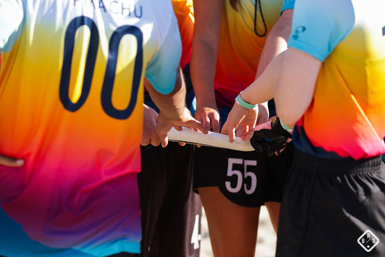
This matters most for player numbers. A number can look perfectly clear in a design file and become surprisingly difficult to read once it is placed over a detailed pattern or a similar shade.
As a useful benchmark, current WFDF rules require shirt numbers to have a contrast ratio of at least 6:1 against the primary shirt color. WFDF also requires the number to be a single color and clearly visible from a distance. Your own league or tournament may have additional requirements, so check those before production.
You can test a color combination using a contrast checker instead of relying on your eyes alone. Our jersey number design guide has recommended number sizes and a checklist.
As a general design rule, strong contrast is usually more important than making the number itself elaborate. A simple, readable number will do its job better than a decorative one that disappears into the artwork.
Not sure about your colors?
Send us your colors and we’ll check the pairing before it goes to proof.
Choosing colorblind-friendly jersey colors
A color combination can look obviously different to you and still be difficult to distinguish for someone with a color vision deficiency.
This is particularly important when choosing the colors for your light and dark jerseys. Don’t rely on hue alone. Two colors can be very different in name while having a similar perceived brightness, making them harder to distinguish.
For example, red and green may look clearly different to many people but can become much harder to distinguish for someone with red-green color vision deficiency.
The easiest approach is to consider both hue and lightness. A dark color paired with a clearly lighter color will usually create a more reliable visual distinction than two colors with similar brightness.
This matters for the jerseys themselves, but also for your numbers. Check the number and background combination separately rather than assuming that a pair of jersey colors will automatically produce readable numbers.
Sublimation gives you more freedom with color
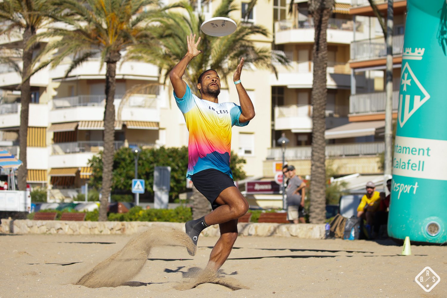
One of the advantages of sublimated ultimate jerseys is that you’re not limited to a small number of colors in your artwork.
The design is transferred into the polyester fabric, which makes detailed patterns, gradients, illustrations and full-color artwork possible across the jersey.
That means you don’t need to choose your team colors based on the number of colors you can afford to print. You can choose colors because they work for your club.
At Manta Squadron, we can also work from precise color values. If your team already has an established color, send us the hex code rather than simply saying “blue” or “dark red”. A precise color value gives the design team a much clearer starting point.
More colors are available, but that doesn’t mean more colors are always better. A strong jersey design can use two colors or ten. What matters is whether the colors have clear roles and work together.
How to choose your ultimate team colors
If you’re starting from scratch, don’t jump straight into a color picker. Start with what already matters to your team.
1. Start with an existing color
Your club may already have a color that everyone associates with it. It could come from a school or university, an old team jersey, a sponsor, your logo or even the place your team comes from.
If a color already means something to your players, that’s usually a better starting point than inventing a completely new identity.
2. Look at your regular opponents
Think about the teams you play most often.
If three of your regular opponents already wear dark blue, choosing another nearly identical shade may create unnecessary problems. You don’t need to avoid every similar color, but knowing what you’ll regularly face can help you make a better decision.
3. Start with two or three main colors
Sublimation means you can use as many colors as your design needs, but a strong kit doesn’t need a huge palette.
A simple starting point is:
- One main color for the jersey identity.
- One supporting color for contrast and secondary elements.
- One accent color for numbers, details or highlights.
You can always introduce more colors through the artwork once you’ve established the basic palette.
4. Make sure the light and dark sets work together
Your two jerseys don’t have to be simple inversions of each other.
A dark navy jersey can work with a predominantly white light jersey. A bright color can become an accent on one set and the main color on the other. The important thing is that both clearly belong to the same club.
Think of them as two expressions of one identity rather than two unrelated designs.
5. Check the design before production
Once your colors are chosen, test them on the actual jersey design rather than judging small color swatches in isolation.
Look specifically at:
- Number readability.
- Light versus dark jersey contrast.
- How the colors work with your logos.
- Whether patterns make any important elements difficult to see.
- Whether the design still looks recognizably like your team.
This is exactly what the proof stage is for. Get the design in front of the whole squad before production and ask people to look at it from both a design and practical perspective.
The best ultimate jersey colors are the ones that work as a team
There is no universally perfect color combination for an ultimate frisbee jersey.
A minimalist black and white kit can look just as strong as a bright, colorful sublimated design. What matters is whether the colors create a clear identity, work across your light and dark sets and remain easy to read on the field.
So start with what your team already stands for, check the practical requirements, and then give the design enough freedom to become something distinctive.
Your colors should make your players look like they belong together before anyone even notices the name on the front.
Frequently asked questions
Do ultimate teams need both a light and dark jersey?
For WFDF events, teams are required to bring at least two distinct sets of shirts to each game. For other leagues and tournaments, requirements can vary. Even where it isn’t mandatory, having light and dark jerseys is useful because it helps avoid color clashes with opponents.
What colors work best for ultimate frisbee jerseys?
There is no single best combination. Start with colors that represent your team, then make sure the light and dark sets have enough contrast and that numbers remain easy to read. A simple two- or three-color palette is a good starting point.
How much contrast should ultimate jersey numbers have?
Current WFDF rules specify a minimum contrast ratio of 6:1 between the number and the primary shirt color for WFDF play. Other competitions may have different requirements, so check your own league rules before production.
How do I choose colorblind-friendly jersey colors?
Don’t rely on hue alone. Consider how different the colors are in lightness as well as hue, and check both your jersey colors and your number-to-background combinations with a contrast tool.
Can sublimated jerseys use any number of colors?
Sublimation allows detailed full-color designs, including gradients, patterns and multiple colors. You don’t need to limit the artwork to a small number of colors in the way you might with some traditional printing methods.
Can Manta Squadron match our exact team color?
Yes. If your team has an established color, send us the hex code so we can work from a precise color value rather than a general description such as “blue” or “red.”
What if our team colors clash with an opponent?
That’s one of the main reasons to have both a light and a dark set. If you regularly play the same teams, look at their colors before finalizing your own and make sure at least one of your sets provides a clear visual distinction.
Can you help us choose our team colors?
Yes. Send us your existing colors, logo or a rough idea and we’ll help you work out what is likely to work before the design goes to proof.